Full disclosure: This article contains affiliate links. I make a small commission if you buy a Florida State League hat through those links. Think of it as buying me a hot dog at the ballpark — except it definitely pays less than a hot dog costs!
Welcome back to the Tip of the Cap, where every week we go through the hats of an MiLB league to find the best baseball hats from every team. This week we’re taking on the ten teams of the Single-A Florida State League.
Introduction to the Florida State League
I was tempted to break this one down into divisions but that would have been hard. Why? Well when there are 10 teams you might imagine that there are two divisions of 5 teams. And you’d be WRONG. This league has a Western Division with 6 teams and an Eastern division with 4 teams. Why? I’m truly not sure. That’s Minor League Baseball for you. But given that, I didn’t want to write an article next week and only showcase 4 hats. So 10 this week it is!
The league’s 106 years old (founded in 1919) but has had even more teams! 119 total teams have been organized inside this league during its history. Many from the same town with new team names, but it’s enough to make your head spin. The league did suspend operations from 1928 until 1936, and again took 5 years off from 1942 til 1945 during World War II.
This MiLB league churns out great hats like Florida churns out weird news headlines. I will admit to being opposed to the idea of the Florida Man, but I imagine many of them had one of these beauts on their head while entering into whatever situation immortalized them.
West Division
Let’s dive into some hats, shall we? We’ll start with the 6 teams from the West Division.
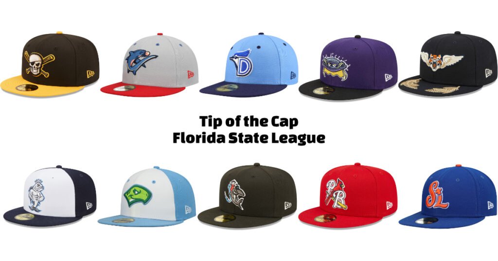
Bradenton Marauders Black Authentic

You know what’s cooler than pirates? Nothing. That’s what. And I mean that. Pirates are cool. This hat gives you a Jolly Roger of your own right on the forehead. The skull and crossbones logo is menacing in all the right ways, and that yellow brim? chef’s kiss.
Being the Pittsburgh Pirates’ affiliate, they had to go hard with the whole buccaneer thing, and boy did they deliver. This hat sits right in the Pirates color schemes, and vibes as though its saying “I might steal your base, and also your ship.”
Realistically I think you could wear this hat with most outfits. Because nothing says “versatile fashion accessory” quite like a skull and crossbones on a hat. Wearing this to a job interview? Maybe not. Everywhere else? Absolutely. Great MiLB hat.

Clearwater Threshers Gray Alternate
Why does this hat give me the same feeling as a Starter Jacket? This is that vibe’s cooler younger sibling. The gray paneling with the red brim is giving me major throwback vibes in a way I can’t quite put my finger on.
Look, I know what you’re thinking — “It’s just a gray hat with a shark on it.” First off, how dare you. Second, this is exactly why it’s perfect. It’s clean, it’s sharp, and the shark looks mean.
It’s sophisticated shark fashion, people. Get with it.
Dunedin Blue Jays Light Blue/Navy Authentic

Strong entry from the Dunedin Blue Jays. Let’s talk about this “D” logo for a second? It’s like those Russian nesting dolls, but make it baseball. Every time you look at it, there’s another “D” hiding in there. It’s like one of those “how many triangles” optical illusions that your aunt shared on Facebook. (This MiLB hat has 6 individual “D’s” I believe, depending on how you break it down. 7 if you include the Brim! (you shouldn’t.)
The three shades of blue that make up this Dunedin Blue Jays hat are chef’s kiss perfect. They’re calm, pleasing, and well blocked with each other to not stand out while complimenting each other perfectly. It works. I even love how they’ve subdued the brand logo, something that often bothers me on New Era hats.
This hat is simple, it’s clean, and it integrates the mascot with the lettering better than most other hats. It’s a truly solid addition to a Minor League Baseball hat collection.

Fort Myers Mighty Mussels Purple/Black Marvel x Minor League

STOP EVERYTHING. They made a mussel look cool. Do you understand how impossible that should be? Mollusks are not cool by nature. (Am I insulting you, lover of mollusks? I apologize.) This is part of the Marvel Defender’s of the Diamond collection, and honestly? This mussel could probably take Thanos in a fight. I’m not sure what its powers are, but look at that cape.
Also? Shoutout to Purple Hats. It’s an woefully underutilized color in team branding, and this hat proves why it should be more popular.
Plus, the way they designed this muscular mussel (a phrase I never thought I’d type) is just perfect. It’s got attitude. It’s got style. It’s got… well… muscles.
I’m not really sure what the cape is tied to? Do Mussels have a neck? I love that it disappears into the unknown for us to just surmise. I really really really like this MiLB hat.

Lakeland Flying Tigers Navy Authentic

You know those moments when you see something and think “That shouldn’t work, but it absolutely does”? That’s this hat. It’s a tiger head. With wings. It’s basically what would happen if you let a 7-year-old design a new Pokémon, and I mean that as the highest possible compliment. In my head while it flies around it makes the same sound as the Red Bubbles from Ocarina of Time. I don’t know why, but it does.
I don’t love a brim design, but this one has caught my eye. I think it works, and that’s enough for it to elevate this hat to the top of this team for me. The design is somehow both majestic and slightly ridiculous. Those are two adjectives I strive for in my Minor League Baseball hats.
Is it practical? Maybe not. Will people ask you questions about it? Definitely. Is that exactly why you need it? Absolutely.

Tampa Tarpons White/Navy Marvel x Minor League

Another Marvel Defenders of the Diamond hat, and this time they’ve turned a Tarpon into what looks like Aquaman’s cooler cousin. The swagger on this fish! It’s posing like it just won America’s Next Top Tarpon.
Now, I know what you’re thinking — white panels on a hat? That’s just asking for trouble. But here’s the thing: it works so perfectly with this design that I’m willing to risk it all. Plus, it gives you an excuse to buy a new one when this one inevitably gets smudged.
My favorite part of this hat is the subtle grey shading stitching. I don’t know that I’ve ever seen that effect on a hat before. Additionally, the light blue outline is a pop of color that drives your eyes right to the mascot, and can we talk about the crown? They put a crown on a fish. And somehow made it look regal. That’s the kind of confidence I’m trying to have in 2025.

East Division
Moving on we’re going to take a look at the Eastern Division’s four teams. Here we go!
Daytona Tortugas White Authentic Road

This hat vibes like Pixar. I think that’s why I’m drawn to it. The mascot is a little large, and looks a little mischievous, and really just feels popped out of an animated feature or a Saturday morning cartoon as the scamp character. I am HERE for it.
I love that there are two different greens on this hat and they’re reserved exclusively for the character. Keeping that color sequestered to the main event means you have no chance of looking at the wrong spot. The sky blue surrounding it ties it all together as a unified hat.
I love the splash of white in the turtle’s neck and eye. They create negative space with the white panel the character is on and force you to make eye contact with this turtle. Which rocks. We should make eye contact with more turtles.
This turtle look like he’s about to steal home and your heart. It’s the kind of hat that makes people smile, and isn’t that what minor league baseball is all about?

Jupiter Hammerheads Black Authentic Team Home

This hammerhead shark is wearing its own team hat. That’s it. That’s the whole tweet. It’s literally a hat on a hat. Hatception, if you will. And I absolutely will.
I love using a fish hook to make the “J” for Jupiter. And I love the red of the lighthouse rising above them both while also giving a surface for the shark to lean against. Perfect, immaculate vibes. The shark looking cool as a cucumber while wearing team merch? That’s the kind of self-awareness I respect in a logo.
I don’t really know how to describe why, but this whole design feels like it walked straight out of a 90s anti-drug PSA, but in the best possible way. It’s got that “too cool for school” energy that makes you want to high-five a shark, which is generally inadvisable but I get it.

Palm Beach Cardinals Red Authentic Collection Team Home 59FIFTY

If you’re going to lean into your Major League Affiliate’s branding, this is how you do it. Grab the colors, grab the logo, and make it just different enough to exist on its own. The Palm Beach Cardinals have done exactly that with this hat.
The way that the Cardinal is perched on a baseball bat threaded through the ‘PB’ of Palm Beach makes it all work. I love the forced perspective of the three icons being at different distances. At the end of the day, this feels like a St. Louis Cardinal’s hat. But it’s not, because it also feels like a Palm Beach hat. If you’re not going to lean really far away from your affiliate, leaning in is better than landing somewhere in the middle.
I’m also impressed in the white lettering and outlining that keep a bright red bird from disappearing on a bright red hat. It’s smart design choices and it all adds up to a great hat, albeit a simple one.

St. Lucie Mets Blue Authentic Collection Team Home 59FIFTY

When I saw this hat was ‘STL’ I was sure it would give me St. Louis vibes, but nope! The cartoon nature of the lettering makes it feel something all its own. The curves and bends give the hat a whimsy that lets St. Lucie own the letters all on their own. If this were a cartoon, those letters are about to break into a song and dance number. It looks like a still frame from the middle of an animated bug at the end of a tv show where the S T and L bounce into frame.
I fully expected the ‘STL’ on this hat to give me St. Louis vibes, but nope! They went full cartoon network with it, and I love every second. The lettering looks like it’s about to break into a song and dance number.
We have classic Mets coloring here, and good for them. Again, there’s no need to lean away from your Major League affiliate. Making your own branding inside the parent organization’s vibes is a great way to approach your merch.
Also I love the bright orange squatchee. I love it a lot.

Next Up: The Northwest League
So that’s the Florida State League for you. Some great hats, some fun hats, and a few hats that are a little more “standard” than my usual choices. Great options all around. All of them 59FIFTY New Era hats, funny enough.
Speaking of fun hats, wait until you see what the Northwest League has cooking. We’re leaving the Single-A leagues and moving to the High-A leagues next week. What’s the difference? Not much, honestly, but technically it is a higher level of Minor League Baseball. We’ll be talking the Eugene Emeralds, Everett AquaSox, Hillsboro Hops, Spokane Indians, Tri-City Dust Devils, and the Vancouver Canadians.
I want you to know I’m already obsessed with the name ‘Dust Devils’, and I can’t wait to see their hats to match.
Stay tuned, hat fans. The High-A hat game is strong, and we’re just getting started.
If you value my writing and want to support me, buy a hat from one of the links above! You can also buy me a cup of coffee! To find me elsewhere, check out my other social media platforms.

