A Note on the Los Angeles Wildfires
I drafted and scheduled this article last week, before the outbreak of wildfires that is currently destroying lives, homes, and businesses across Los Angeles and Southern California. At first I was going to shelve the article for a couple of months, however after considering I thought, well here’s an SEO-friendly article that could redirect people to support opportunities. So I’m publishing it as originally written.
If you or someone you know is affected by the wildfires, there is a long list of aid organizations there to help. I am a big supporter of mutual aid, and Mutual Aid LA Network is one of the shining examples of it. They have incredible resources listed on their website both for those affected, and for those looking to help. *Please* head to their website and help however you can.
Additionally they have put together a spreadsheet they are currently updating of available resources for those affected by the fires.
However you can help those affected, please do so, even if it’s just being an ear for those who might need it. If you know someone displaced by the fire and are able to help them, please do so. And support Mutual Aid LA Network and all other organizations doing their part to support people during this crisis. A lot of their resources will be dedicated to confronting the massive task in front of them right now, and helping them through it and giving them the support to be ready for the next one is crucial.
You can donate to them through the links on their website, or here is a direct link.
Now then, for something completely different, let’s talk about baseball hats.
Full disclosure: This article may contain affiliate links. I make a small commission if you buy a product through those links. Think of it as buying me a hot dog at the ballpark — except it definitely pays less than a hot dog costs!
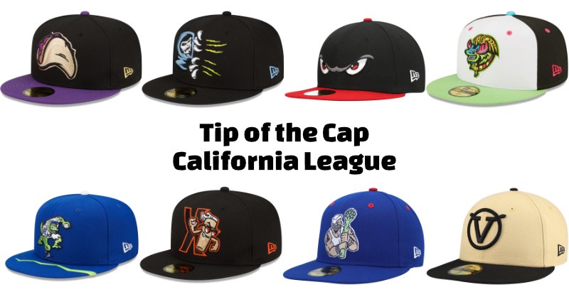
Welcome to Tip of the Cap, a series where I go league by league through Minor League Baseball and select a hat from each team that I think is danged awesome. This week we’re kicking off with the Single-A California League. Which features the Fresno Grizzlies, Inland Empire 66ers, Lake Elsinore Storm, Modesto Nuts, Rancho Cucamonga Quakes, San Jose Giants, Stockton Ports, and Visalia Rawhide.
Something that’s important to know about me, I really believe that Major League Baseball merchandise is bland. In fact, I would posit that there is a sliding scale of consistently cool merch where Single-A is the most cool all the way up to Major League Baseball which is the least cool. I’ve yet to find a Minor League team with no hats that I enjoy, but narrowing it down inside the teams of the California League has been honestly tough.
Welcome to the California League
The California League has quite the history. Established in 1941, the league shuttered it’s doors just two years later during World War II, reopening in 1946. They have never been a high-tier minor league team, starting their life as a Class C league which was recategorized in the 60s to the Single-A classification. Over their history the San Jose Giants hold the most league championships at 14 (most recently in 2021).
Despite the name of the league, historically not all participating teams have been from the state of California. Reno and Las Vegas have both been members of the league at various points in history. To be fair, Vegas only was active for a single year, but Reno was part of the league from 1955 until 1992. Many top-tier baseball players have spent time in the California League, including: Adrián Beltré, Rollie Fingers, Ken Griffey Jr., Reggie Jackson, Pedro Martínez, and Mike Piazza.
The league has its own quirky traditions outside of apparel. The San Jose Giants have a “Smash for Cash” night where they drive a bread truck onto the field and one contestant gets 3 tries to smash its headlights with a baseball. Also once a year the Lake Elsinore Storm make admission and parking free, and the mascot / PA announcers get the night off. The game of baseball is entirely free to enjoy and the game is all that’s on that night, no other entertainment. Maybe my favorite, however, goes to the 1986 San Jose Bees. The Bees were an unaffiliated team with a roster made up of Major Leaguers serving drug suspensions and a few players on loan from Japan’s Seibu Lions.
All in all, California League baseball lives up to why I love Minor League Baseball so much, and each team has an A+ hat that I would like to add to my collection (if I don’t own it already).
Here are some things to know about the origins of my hat selections.
Copa De La Diversion Rebrands
Since 2018 the league has encouraged teams to rebrand for a single game to connect with their local Hispanic/Latin communities. A few hats on this list come from the Copa De La Diversion rebrands. I own quite a few of them myself, I’m a huge fan of the vibrant colors and atypical designs!
Local Food Rebrands
Often you will see teams rebrand as a local food item to also connect with the local community (and create merch for people [me] to spend money on). The food hats are some of my absolute favorites because they are almost always a conversation starter with anyone you talk to. They’re also far more fun and silly than your standard baseball hat design. Multiple articles that I read in researching this named the Fresno Grizzlies as one of (or maybe the) first team to do this, so I’m thrilled the appropriate hat has risen the ranks for me!
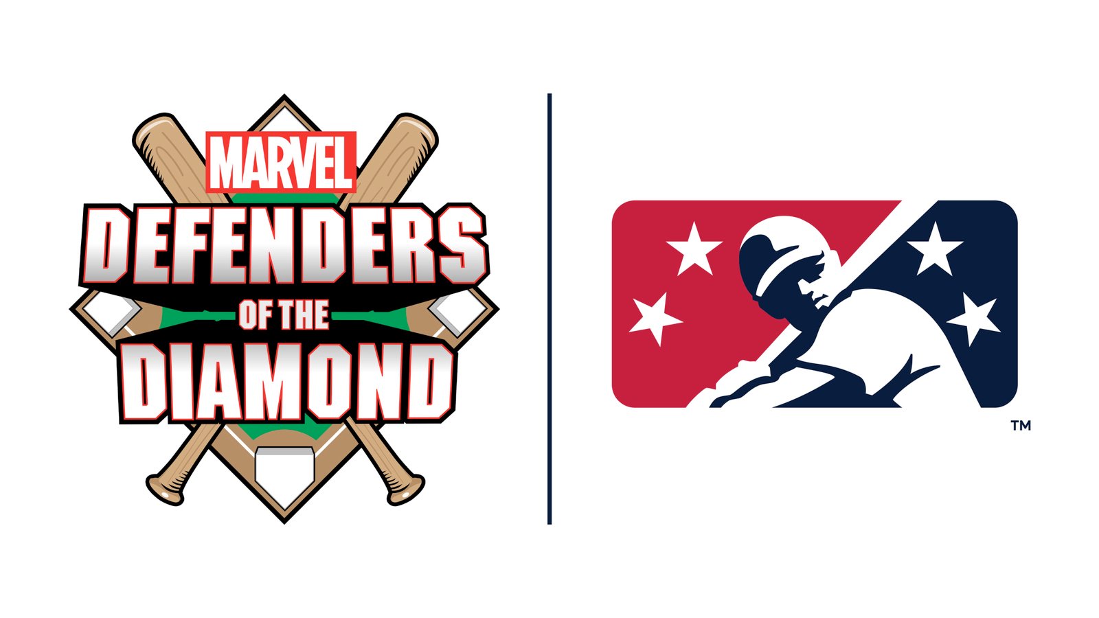
Marvel’s Defender’s of the Diamond Nights
In 2021, Minor League Baseball signed a 3 year deal with Marvel where 96 teams would work with Marvel artists to create superhero-themed jerseys and hats. Additionally each team hosts at least one Marvel night where fans can dress up as their favorite heroes and team mascots would be hero branded. A couple of those hats have also made this list for your enjoyment! (Really, mine.)
So without further ado, let’s get to the hats!
Fresno Grizzlies — Purple Tacos 59FIFTY Fitted Hat
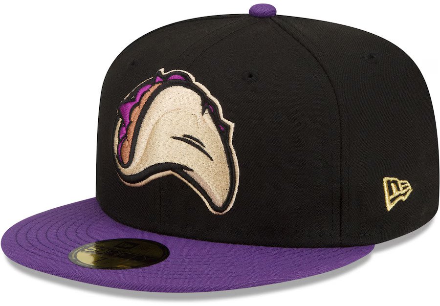
Taco ‘Bout Style!
I’ll see myself out.
I’ve got to tell you, as a first hat of this series, this is an A+ kickoff. The Fresno Grizzlies New Era Purple Tacos hat really sets a high bar. Purple and Black is a classic color combination, and the Taco is comically large. Also, and this is a small thing, but the angle and curve of the taco is overly appealing to my eye. Much like how cartoon food just looks appetizing, the Purple Taco is something I would eat, instantly.
The team rebranded as the Fresno Tacos for the first time in 2015 to honor the abundance of Taco Trucks around Fresno. Multiple articles I read name that moment as the watershed for Minor League Baseball as a whole in regards to food-based rebrands. So supposedly we can thank Fresno for the incredible food-branded merch we get from all over the country. In fact, I don’t know that Tip of the Cap would exist without this choice! So thanks, Fresno!
Regardless of how you feel about baseball, this hat is the ultimate must-have for anyone who loves tacos. Absolutely everyone will crack a smile at that hat. There’s a taco festival in Los Angeles that I try to attend whenever I can hosted by L.A. Taco and I would very much like to roll up to the next one while rocking a Purple Tacos hat. Instant conversation starter.
I do not own this hat, as I own two other Fresno Grizzly hats and I need to have a little self control. But this one is high on my “to buy” list, and it should be on yours too!
Inland Empire 66ers — Los Cucuys 59FIFTY Fitted Hat

Before we kick off, I just want to say that I am a sucker for a hat unlike any other I’ve seen. This falls on that list. Rarely do you see a design so specifically evocative and different and that is 100% why it’s among my favorites on this list.
The Legend of El Cucuy
The Inland Empire 66ers Copa De La Diversion rebrand features El Cucuy. For those who don’t know, El Cucuy is like a ghost-like creature not dissimilar to the boogeyman. Parents use this figure to scare their kids into good behavior. You either eat your vegetables, or El Cucuy will come for you!
Inland Empire rebranded as the Los Cucuys de San Bernardino and released a whole line of absolute banger hats. This one gets my top marks from the collection.
Atypical Design Comes to Life
Here’s what I love about this hat. The design feels like it’s jumping out at you. Rarely do you get a sense of movement from a baseball hat but this one feels like you’re watching a scene from a horror movie in real time. It’s as if El Cucuy itself is sneaking up on you every time you wear it. If you wear this hat, it makes a statement. People will absolutely want to know what it’s all about, and you’ll get to talk about your favorite subject, Minor League Baseball hats (okay, that’s just me). There are few hats as bold and exciting as what Inland Empire has released here.
Raised Designs and Stitching
Now let’s talk about the color and design. It’s not just a flat image; it pops right out at you! The nails are raised higher than the claw marks, and less than El Cucuy’s face giving a sense of scale, as though it’s reaching out right at you. I love how the stitching is so bold that every detail is easily discerned. The blue and grey creates a sense of branding that makes the yellow claw marks feel wrong, dangerous.
If I had one critique, I think they could have leaned into the Inland Empire 66ers branding a bit more and made the claw marks orange. The blue and grey aligns with what you see on the primary Island Empire merch, but they have a pop of orange that I love. I think they could have incorporated it to really nail the cherry on top.
Regardless, however, I wish I owned this hat. I think I’d wear it and suddenly feel like I could conquer the world — or at least scare a few kids along the way.
Lake Elsinore Storm — Home 59FIFTY Fitted Hat
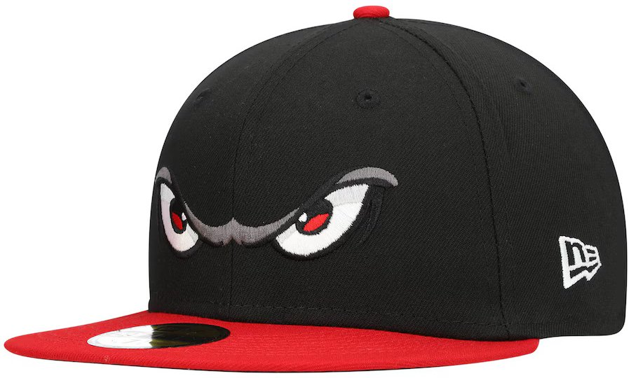
The Only Acceptable Reason for Someone to Say “Hey Four Eyes!”
Story time. I own a Storm hat, and I also wear a backpack that has a Beholder plushy hanging from the shoulder. This one, in point of fact. I was once chatting with my wife right before I left our apartment while wearing this hat and sunglasses. She paused, looked at me, and said “Ned, there are too many eyes to look at at once. Between the hat, the beholder, and your sunglasses I think you’ve got like 15 different eyeballs I can focus on. That’s too much.
Readers, I promise you, it was not too much. It was just right. You too can have an overabundance of eyes on your head. This is not a negative, I promise, no matter how weird it sounds while writing it.
Sleek Color Blocking and Design Makes the Main Feature Jump Out
Let’s talk about the hat design. I am obsessed with how much the eyes jump off the hat. Its very simple, black background with shock white eyes make for the ultimate contrast. Add in the pop of red in the pupil that aligns with the Brim and the Squatchee? Aces. The touches of grey to highlight the features only serve to enhance the whole package.
(Fun Fact: the Squatchee is the little button on top of a baseball hat. It’s an awesome word, and I’m sure as you keep reading these articles, I’ll use it just too much. It’s exceptionally fun to say. Try it with me. Squatchee. Squatchee. Squatchee. Yes. It rocks.)
There is one other bonus feature to this hat. It’s always angry. Look at those eyes, they’re ready to fight! If you’re not ready to fight? Well then you can rock this hat and let it do the talking for you. Wear it backwards and you’ve got eyes in the back of your head, literally!
A Match Made in Hat-ven
I spent far too long trying to make a pun here. I failed. But I am too proud to admit defeat. So I gave a bad one. For that I’m sorry.*
*No I’m not.
I am a big video game fan and Super Mario Odyssey is one of my favorites of the last decade. The moment I got my first Storm hat, I wished desperately for a partnership between Lake Elsinore and Nintendo to make an official Cappy branded team hat. Can you imagine how cool that would be?! I am fully comfortable admitting that I have imagined I’m wearing Cappy while wearing my Storm hat. I give you permission to do so as well. Let your inner kid out. Let that imagination flow!

Modesto Nuts — Alebrijes de Modesto 59FIFTY Fitted Hat

Los Alebrijes de Modesto
The Copa De La Diversion rebrand for the Modesto Nuts takes the shape of Los Alebrijes de Modesto. According to their website, an Alebrije is a mythical creature that guides us from one life to the next. They have chosen three Alebrijes to represent this rebrand. There’s a Coyote, a Moose, and an Eagle.
The hat I have selected features the Moose, in a collection of vibrant colors with a design you’re rarely going to see anywhere else. Modesto Nuts merch takes bold swings, this hat is no different.
Bold Choices Make Bold Fans
I’m obsessed with strong choices in color when it comes to hats. I’m a big believer in simplicity exclusively because it can make a hat feel messy real fast to have too much going on. This hat is the exception to that rule. That light green brim with the white color background, pink eyelets (that’s what the air holes are called), and a blue Squatchee could be an unmitigated disaster. Yet it isn’t because of how each color integrates into the moose design AND the black coloring on the side and back panels frames the front perfectly to give it the structure it needs to work.
The Modesto Nuts took a huge swing here and it paid off.
The Coyote and the Eagle Designs
You can find Modesto Nuts merch for the other two Alebrijes and they are also fantastic. This moose stands out to me because of the whole hat concept. Plus I’m from Maine, so you know I love a moose.
Rancho Cucamonga Quakes — Marvel’s Defenders of the Diamond 59FIFTY Fitted Hat

Our first Marvel’s Defenders of the Diamond hat for this list!
A Brim Design is Risky
Whenever a Minor League Baseball team reveals a hat with a Brim design, I am instantly skeptical. This will sound ironic given what I’m writing about, but they just often look juvenile, and not in a fun way. For it to work, it has to be integral to the design and significantly enhance the overall experience of the hat This hat does it in spades.
Designing for the Whole Hat
What pulls off the brim, then, is the design that grows off the front panel. For this design Rancho Cucamonga’s mascot Tremor the Rallysaurus has been given the Marvel treatment. He can be seen here punching the ground and breaking open a fissure which we can surmise is the cause of the crack across the brim.
From a design perspective, the color separation is key. Blue, white, vibrant green, grey, framed by unobtrusive black stitching. That’s what you get from this hat. Blue eyelets keep the canvas from getting in the way of the design, but a white Squatchee adds just a little pop of color at the end. And let’s talk about Tremor. The detail on this dino is fantastic! I’m especially obsessed with the grey scale flecks all over his body that add just a touch of depth to the overall picture.
Marvel Design Work
There’s something uniquely satisfying about seeing a mascot that’s had the same rough style for a long time get a complete overhaul. The Marvel rebrands allow us to do exactly that and it makes Tremor all the more exciting on this hat. I hope they give Aftershock (Tremor’s little brother) the same treatment in the future!

San Jose Giants — Beer Batter Theme Night 59FIFTY Fitted Hat

You Can’t Strike Out with the Beer Batters
Let’s start with the most important piece of the Beer Batters. If you attend a San Jose Beer Batters game, they will designate a player on the other team the “Beer Batter”. If that player strikes out? Beer around the park is half off for the next 15 minutes. WHAT A GREAT THING. It reminds me of when Boban Marjanovich purposefully missed a Free Throw so the home team fans could have a free chicken sandwich. I wonder if a team taking on the Beer Batters has ever purposefully struck out and then shouted “you’re welcome!” to the stands.
Homaging a Great Part of the Ballpark Experience with a Brew-tiful Design
When I think of baseball, I think of (among other things) beer. This rebrand works great for me right off the bat.
The backwards K, celebrating the strikeout tradition? The black and orange design that stays out of the way of the real king of this hat, the mascot? The mascot sporting shades that reflect a baseball that’s also the sun? That last part I’m not sure on but I love it, even if I don’t fully understand the purpose.
If I had one gripe, the baseball in its hand is a bit hard to make out. The stitching is too wide for that small of a design, and if they’d increased the overall sizing of the mascot by even 10% I think it would solve my problem. This is a small gripe, I would wear this hat all the time. It’s also unobtrusive enough that you could wear it to most baseball games and it could work as simply a strikeout hat. Versatile.
Plus it’s a fashion statement that screams, “Is it beer o’clock yet?” I don’t own this San Jose Giants fitted hat, but it’s going in my cart for sure.
Stockton Ports — Marvel’s Defenders of the Diamond Fitted Cap

Marvel hat number 2 for the list!
Meet 5 O’Clock Dock and the Mighty Asparagus
5 O’Clock Dock is the mascot for the Stockton Ports. A muscly tattooed sailor wielding a massive Asparagus stalk. Alternatively, 5 O’Clock Dock is tiny and the Asparagus is properly proportioned. Either way, it’s an awesomely unique hat. Unlike many of the Marvel rebrands, this one is strikingly similar to the real hat. They’ve simply made 5 O’Clock Dock look a little bit more human and superhero-y, and changed the angle of the Asparagus to look more like a baseball hat. The core stays the same, however, the grimace, the cap over one eye, and the tattoos along his arms.
I knew none of this when I bought the hat myself, however. I own this hat, I wear it all the time, it gets some of the most compliments of any in my arsenal. I highly recommend this one. When I first laid eyes on this Stockton Ports hat, I couldn’t help but chuckle. Here I was, faced with a beefy sailor brandishing an asparagus stalk as his trusty baseball bat. I needed it immediately. The hat introduces far more questions than answers, and when the answer is “what, you didn’t know that Stockton California is the Asparagus capital of the world?” the conversation practically writes itself.
A Superhero Makeover
Marvel took 5 O’Clock Dock and gave him the superhero makeover he deserved. It’s a simple design, on a bright blue hat, that doesn’t try to take away from the main attraction. However because the Stockton Ports team colors are based on the Stockton California city flag, you get the red eyelets and Squatchee to unobtrusively complete the total color branding.
This hat is strange, it’s hilarious, it’s ridiculous, and it’s absolutely perfect for a hat collection.
Visalia Rawhide — Cream 59FIFTY Fitted Hat

Many of the hats I highlight get my “fave” pick because they are bright, bold, and flashy. They often have designs that start conversation and that stand out in a crowd. A friend once told me I wear my MiLB hats like I’m a peacock in full plumage. I’m picking this hat for the exact opposite reasons.
A Classic, Traditional Style That Still Feels Unique
Let’s start with the subdued cream and brown colors, and nothing else. It’s like that friend who doesn’t need to shout to be heard. It’s refreshing in a market where neon colors can reign supreme. It also feels nostalgic in a way, the way yellowed papers in a book convey age, the cream color feels like a team with a history. You’ll notice too that the colors go out of their way to stay unobtrusive with no single piece stealing the focus. The eyelets and stitching match the panels, and the Squatchee matches the logo and brim. This Visalia Rawhide hat sports a perfect color compromise.
Unique (V)ibe
Now let’s talk about the V design. I’m obsessed. It vibes like a cattle brand, which makes sense giving the Rawhide name and that their mascot is a Holstein Bull named Tipper. The whole branding package then gives a sense of Americana, nostalgia, and tips its cap to the dairy industry within the Visalia community. Part of the outfield fence in their home stadium is a 40’x20’ barn that is Tipper’s home. It specifically references that batters “can’t hit the broad side of a barn.” I’m obsessed.
Saying Goodbye to the California League
So of the 8 teams in the California League, those are my favorite hats currently available! If you pick up one or two for your own collection, let me know which ones! Additionally, if you think I’ve selected the wrong hat to represent California League baseball, I want to know which one you think deserves the nod instead!
Will you outfit yourself with a new Fresno Grizzlies fitted hat? Or maybe pick up a collection Inland Empire hats? Me? I’m forcing myself to a strict budget, but you can expect to see at least a couple of these starting my rotation. Perhaps you’ll see them adorning my dome on upcoming episodes of Daily Tips That May or May Not Help You this year!
Next Week — The Carolina League
Next week we’ll turn our attention to the Carolina League. This is a 12 team Single-A league that’s split into two divisions. We’ll take the North Division next week, and the South Division the week after that. Looking ahead at their catalogues (and at the ones I already own) I’m standing by my statement that Single-A merch is way cooler than Major League Baseball. Perhaps on a sliding scale that we’ll uncover over the next few months.
Until next time, this has been Tip of the Cap.
Supporting those affected by the Los Angeles Wildfires
Please support Mutual Aid LA Network. They are an incredible organization and they need resources now more than ever. The work they do is on the ground and has no basis in profit. They are simply doing the good work to support residents of Los Angeles. If you have the ability to help them, please do.
If you value my work and want to support me, buy a hat from one of the links above! You can also buy me a cup of coffee! To find me elsewhere, check out my other social media platforms.

