Full disclosure: This article contains affiliate links. I make a small commission if you buy any of these minor league baseball hats through those links. Think of it as buying me a hot dog at the ballpark – except it definitely pays less than a hot dog costs!
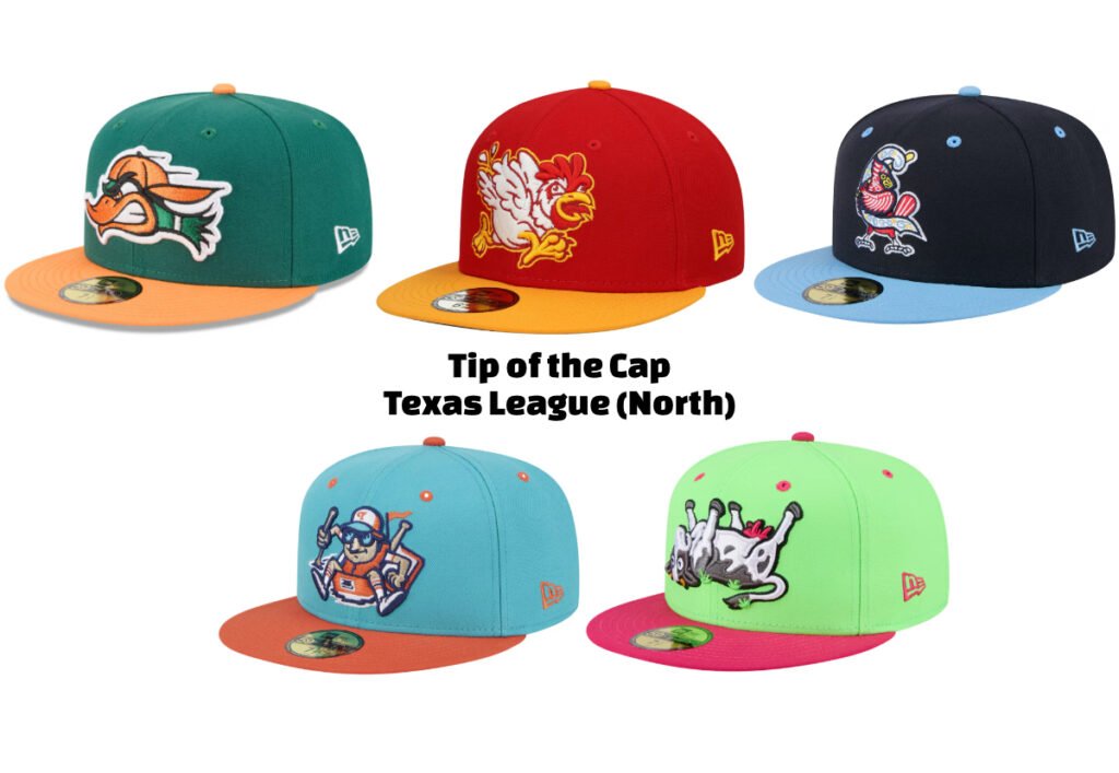
Introduction to the Teams of the Texas League
Look, I get it. When I tell people I write about Minor League hats, they usually give me that confused smile that says “that’s… specific.” But the Texas League’s North Division is absolutely loaded with incredible designs. This league is exactly why I started this blog. Between the Arkansas Travelers, Northwest Arkansas Naturals, Springfield Cardinals, Tulsa Drillers, and Wichita Wind Surge, we’ve got five teams who decided to get weird with their headwear, and I am here for every second of it.
Our friends in the South Division (the Amarillo Sod Poodles, Corpus Christi Hooks, Frisco RoughRiders, Midland RockHounds, and San Antonio Missions) are probably feeling left out right now, but don’t worry – we’ll get to their hats soon enough. Today is all about the North.
Here’s what makes this week’s collection special: every single one of these hats comes from a rebrand. I know some baseball purists clutch their pearls at the mere mention of changing a team’s look, but come on – these alternate identities are exactly what make minor league baseball hats so much fun. When teams lean into their weird side, we get absolute gems, And let me tell you, the North Division brought their A-game this time around. I think this league may have some of the best MiLB hats out there.
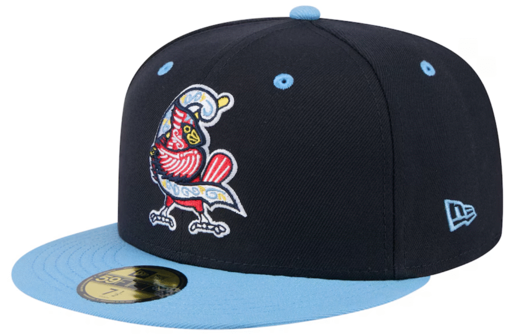
Arkansas Travelers Mad Mallards Rebrand
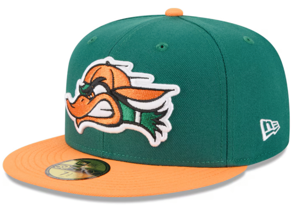
The Travelers took their hometown waterfowl and cranked the attitude up to 11. Enter the Mad Mallards. What’s the vibe? An angry Daffy Duck with enough big teenager energy – that’s what we’ve got here, and it’s everything I want in a baseball hat.
The name itself is perfect – Mad Mallards rolls off the tongue while promising both mischief and mayhem. They went with a green and orange combo that works together stunningly, creating this bold look that catches your eye without being gaudy. They found the sweet spot between classic baseball style and modern flair.
What really sells it is how they handled the logo placement. The mallard dominates the front panel, and where most mascots are horizontal and constrained by the forehead, this duck is horizontal. That allows the team to crank up the size and really pop this off the hat without cluttering the design. Every element of the design feels intentional. Even the double sized white stroke around the entire design gives an aggressive energy that makes for one of the coolest minor league hats I’ve seen.
This isn’t just a baseball hat – it’s a statement piece that speaks to both die-hard fans and design nerds like me. To me, this is one of the best minor league hats you can buy.
Northwest Arkansas Naturals Growlin’ Chickens Rebrand
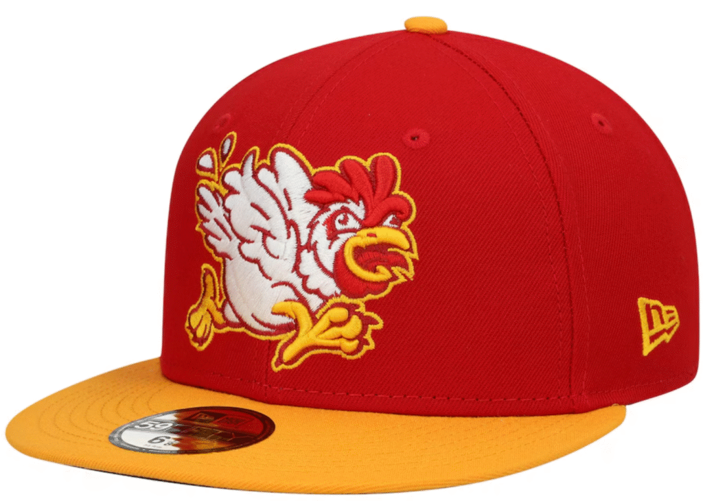
The Naturals took a chance on something completely wild – the Growlin’ Chickens. Turns out chickens really do growl when protecting their nests (who knew?), and the team ran with it, promising plenty of growlin’ during home games. What that gives us is a fun, weird chicken mascot that’s evocative and exciting. I love it.
A pissed-off chicken is exactly the kind of mascot I live for. It reminds me of those chickens in Legend of Zelda that would absolutely wreck you if you messed with them one too many times. This hat was made in honor of Northwest Arkansas’ poultry industry, but also allows a real sense of identity for the team and fan alike.
As for the look? They went bold with red and yellow – colors that kind of seem way too much in this photo but I promise you that they somehow work perfectly in person. It’s like they found that sweet spot between “look at me!” and “but like, in a good way.” The whole package captures exactly what I love about the minor leagues – they’re fun, fearless, and refuse to take themselves too seriously.
See also my above comment about horizontal vs vertical mascot designs on minor league baseball hats. Larger mascots is almost always good on a hat.

Springfield Cardinals Copa de la Diversión Hat
I’m gonna be real with you – picking just one Cardinals hat was a journey. Their merch game is strong, but this Copa de la Diversión hat? It stands out among the Copa offerings across all the minor leagues and that’s why it was my choice.
The Los Cardenales rebrand is really special. It’s rare that a Copa de la Diversión design is a reimagining of the primary logo. Usually we get something different entirely. Looking at this hat? I wish more teams would lean into their normal branding instead of going for something completely different when entering the Copa initiative. The design team nailed it here – bold but still unmistakably Cardinals.
What really sells me on this hat though? The understated approach. They went with classic blue tones instead of going wild with colors like most Copa hats. It’s subtle, which makes it feel like a genuine part of the team’s identity rather than just a one-off. In a world where Copa minor league baseball hats usually scream for attention, this one stands out by whispering.

Tulsa Drillers Raft Racers Rebrand

I have to give a shoutout to Sam Frazier and his “Smart People Being Stupid” web series. Their most recent season captured a Cardboard Boat Race and it’s the first thing I thought of when I saw this hat.
The Raft Racers rebrand is exactly what I love about minor league baseball. The Drillers took a local touchstone – the Tulsa Great Raft Race – and turned it into this perfect piece of community storytelling. But what makes this hat truly special isn’t just the history, it’s how they absolutely nailed the execution.
Let’s talk about that color combination for a second. They went with turquoise and orange, a stunning color combination often ignored in the minor leagues. In fact I can only think of Copa hats that have used this color scheme and I wish more primaries did so as well. The turquoise does the heavy lifting as the main color, while the orange accents on the brim, eyelets, and squatchee (that’s the button on top, for those playing along at home) make the whole thing pop. It’s bold without being loud, distinctive without trying too hard.
This is exactly the kind of design I want to see more of. Every element feels intentional. The logo manages to be both playful and iconic, striking that perfect balance between “yeah, that’s a guy in a raft” and “this is a legitimate sports team’s hat.” It’s the kind of piece that makes people stop and ask questions, which is exactly what great minor league merch should do. I think this is among the best minor league baseball hats out there.

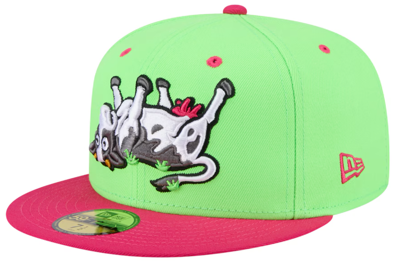
Wichita Wind Surge Copa de la Diversión Hat

When I was looking through these Wind Surge hats and say there was a Copa rebrand as the Tumba Vacas (Cow Tippers) de Wichita, I was sold immediately. The design is pure joy, with this massive tipped-over cow sprawled across the front panel. Once again it’s a perfect rebrand – taking local culture and cranking the fun up to 11.
The design team knocked it out of the park with the color choices. They went with this wild pink/red accent that works perfectly. You’ll find it on the brim, squatchee, eyelets, and – tying it to the mascot – the cow’s udders. That simple design choice causes is your eye to track the whole hat while you take it in. It’s really smart design work.
We’re back to horizontal vs vertical mascot design on minor league baseball hats! Because here they didn’t just slap a cow on the front and call it a day. The cow is basically the whole front panel, giving all details enough space to stand out, and causing this hat to make far more of a mark than other MiLB offerings. People will notice and remark on this hat for sure. That’s what great minor league merch should do – start conversations and bring people together through shared laughs.
Looking ahead to the Minor League Baseball Hats in the South Division of the Texas League
The South Division of the Texas League is going to be wild. I know I’ve been geeking out over the North Division’s hat game, but just a quick glance at the south says there’s some cool minor league baseball hats coming up. The San Antonio Missions and Frisco Rough Riders are just waiting to show off their stuff. If you like these MiLB hats and think the North set a high bar with their bold designs and creative logos, just wait.
The North Division gave us some absolute bangers in their minor league baseball hats. Now it’s time to see how the South responds. Each hat is going to tell us something about its community, its team, and the creative minds behind it. And I can’t wait to break them all down for you.
If you value my work and want to support me, buy one of the minor league baseball hats from one of the links above! You can also buy me a cup of coffee! To find me elsewhere, check out my other social media platforms.

