Full disclosure: This article contains affiliate links. I make a small commission if you buy any MiLB hats through those links. Think of it as buying me a hot dog at the ballpark – except it definitely pays less than a hot dog costs!
The Western Division of the Midwest League is a wonderland of baseball hat designs. Each team brings something special to the table, and I’m excited to dive into them. From simple, effective looks that’ll never go out of style to unique designs that make you do a double-take, these MiLB hats offer fashion that goes way beyond the baseball diamond.
Welcome to the MiLB Hats of the Midwest League
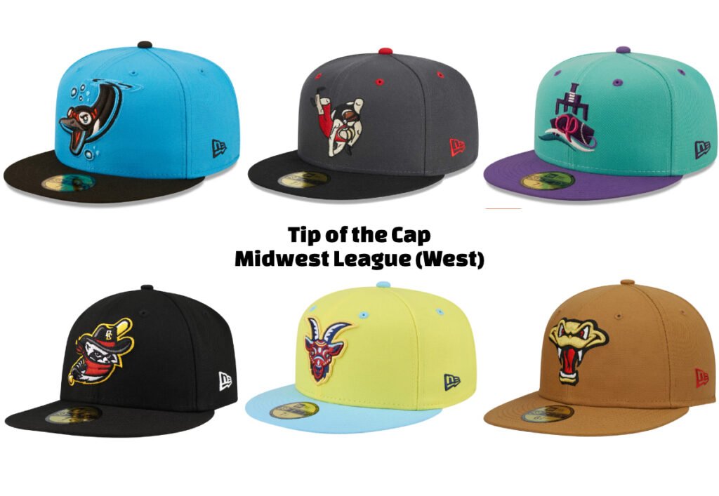
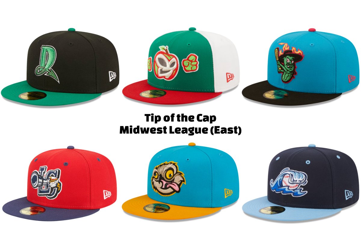
There are 12 teams in the Midwest league, and we’re going to look at 6 of them in this article. This week features the Beloit Sky Carp, Cedar Rapids Kernels, Peoria Chiefs, Quad Cities River Bandits, South Bend Cubs, and Wisconsin Timber Rattlers. To read my selections for the Dayton Dragons, Fort Wayne TinCaps, Great Lakes Loons, Lake County Captains, Lansing Lugnuts, and West Michigan Whitecaps, check out this article.
Some notable alumni from the league include: Albert Pujols, Clayton Kershaw, Mike Trout, David Ortiz, and Greg Maddux. It’s always fun knowing where superstar players got their minor league starts!
This league sports a collection of MiLB hats that are packed with character. Each team had multiple hats that excited me, and narrowing it down to one was a challenge. I’ms cared they’ll have released even more awesome hats by the time I get back to this league! In this league you’ll find creative logos, bold color choices, and fantastic rebrand options that are sure to become staples in your hat collection.
Honestly, the hat competition across Minor League Baseball is almost more exciting than what’s happening on the baseball diamonds! Everyone has to one up each other, and in doing so, the quality of headwear offerings continues to skyrocket. For this week’s group, I think the standouts could be added to anyone’s collection right now.
Beloit Sky Carp: A Goose with Attitude
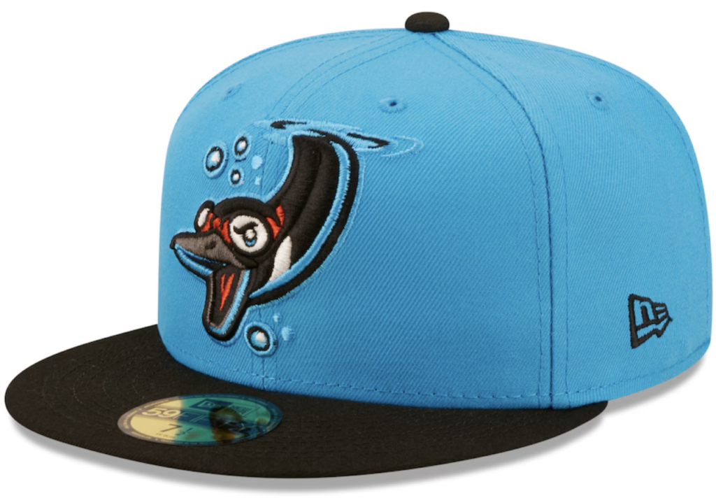
Picture this: you’re walking down the street wearing a royal blue hat with an angry goose that looks ready to throw down. Someone shouts from across the street, “Hey! Nice hat!” You turn, also ready to throw down, before you realize it’s a compliment. You smile and yell back, “Hey, thanks!” Then you wonder why you were so ready to fight in the first place.
I’ve lost the point, anyways, this hat kicks ass.
The Sky Carp name comes from those stubborn geese that say “nah” to flying south for winter. These birds are famously grumpy, and this hat captures that perfectly. The blue is electric, making the mad goose logo pop like it’s about to leap off your head and chase someone across a parking lot.
Choosing just one Sky Carp hat was tough – they’ve got about five that could’ve made this list. But this one? The way they’ve used that deep royal blue to emulate water, with the diving goose design breaking the surface is just fantastic. Every piece of the design works together into one of my favorite hats in all of minor league baseball.

Cedar Rapids Kernels: Wrestling Meets Baseball
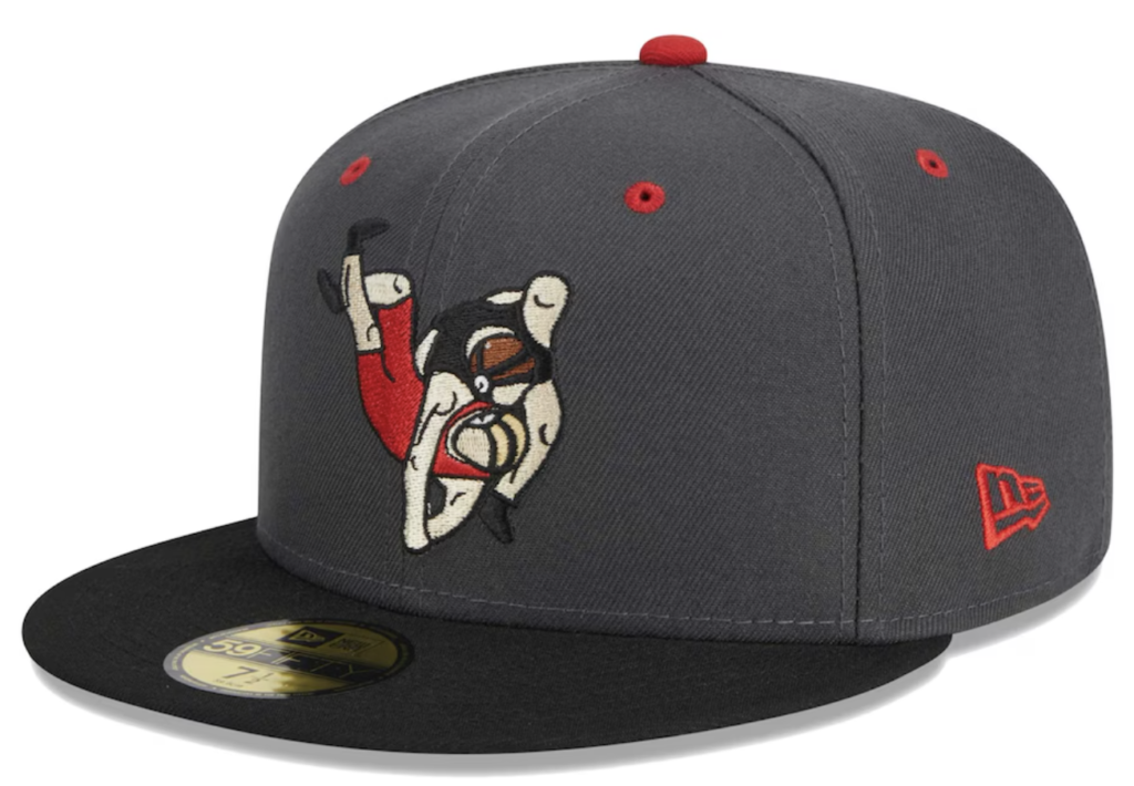
I think this is the first rebrand hat I’ve selected that isn’t a Marvel Defenders of the Diamond, a Copa de la Diversión, or a food item! The Kernels’ rebrand as the Mat Grapplers is in honor of the University of Iowa Wrestling Team. Why? I’ll be honest, I could only find the information that it was, the reason? Not sure. Did they win a title? Host a cool wrestling tournament? Remarkably not sure. Anyone able to help in the comments?
The design of the characters look a little like the people in airplane safety manuals (positve). There was also a collection of “the more you know” ads for MTV back when I was in middle school that comes to mind as well. There is a quirky charm to this depiction of flipping someone to the mat. Or…are they about to kiss? Either way, I’m into it. I’d wear this hat all the time.
I love a dark grey / red silhouette for a color scheme, it’s one of my favorite combos. Then we have the wrestler in red who matches the eyelets / squatchee / new era logo, and the wrestler in black who matches the brim. It’s a great design with great balance that will look great on your head.
I also think you’ll find yourself as one of the only people rocking this hat if you wear it (unless you’re in Cedar Rapids, of course.)

Peoria en el Río: Pure Art on a Hat
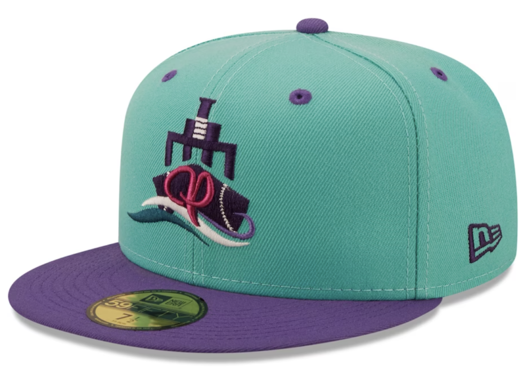
This hat is truly unlike anything else I’ve seen in Minor League Baseball. Where most MiLB hats try to grab your attention by being bold and in your face with their designs, screaming “LOOK AT ME!” this one whispers “check this out”. It’s subtle, completely unique, and dare I say it, the closest hat to being art in all of the minor leagues? It’s compelling, it’s exciting, it’s…elevated? It rocks.
As Copa de la Diversión hats go, this one is top tier. The name and design honors Peoria’s annual En El Río festival and the city’s connect to the river that runs through the town. Between the river, steamboat and dock designs along with the cursive script R, I truly love this hat.
Turquoise and purple are incredible complimenting colors. The purple brim, eyelets, and squatchee make it all come together with the primary turqoise paneling. Having the R be in red brings your eye to the dead center of the logo, and each accenting color is a complete picture worthy of hanging in a museum. It’s a great logo and design and it should be in your collection.
I do wish the new era logo was purple, though. Small gripe, but there you go.

Quad Cities River Bandits: The Coolest Raccoon in Baseball
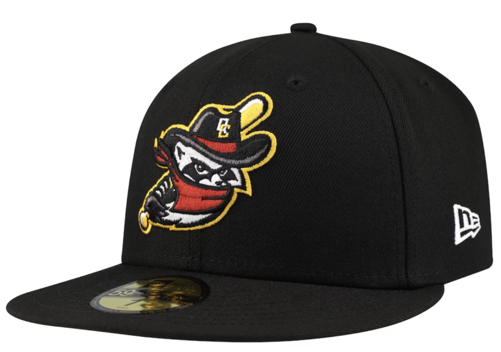
Raccoons are awesome and make great team mascots. They’re mischevious, devilish, have cool coloring, and are such an expressive logo. Let’s talk about this one. He’s got a bandana. He’s wielding a baseball bat. He’s rocking a cowboy hat with the Quad Cities logo. He’s awesome.
If they had that Cowboy hat in their store, I would’ve selected it for this article, by the way. That hat rules.
All black hats are bold moves but they immediately draw your attention to what matters, the logo. It makes the gold-outlined raccoon pop off the hat like it’s going to jump off and steal your snacks…or second base.
Using gold as a stroke around the logo is always an A+ move, and it means the white of the raccoon isn’t conflated with a standard white outline. It does mean that the New Era logo should be gold, however.
All in all? great hat from the River Bandits. I would wear this hat, and I bet it would get compliments. I especially love that it’s a primary team hat. As you all know, I’m a sucker for a rebrand and often skip over primaries, but this one is too good to ignore.
So wear this hat, and look like you’re gonna start a baseball-themed heist. Do it.

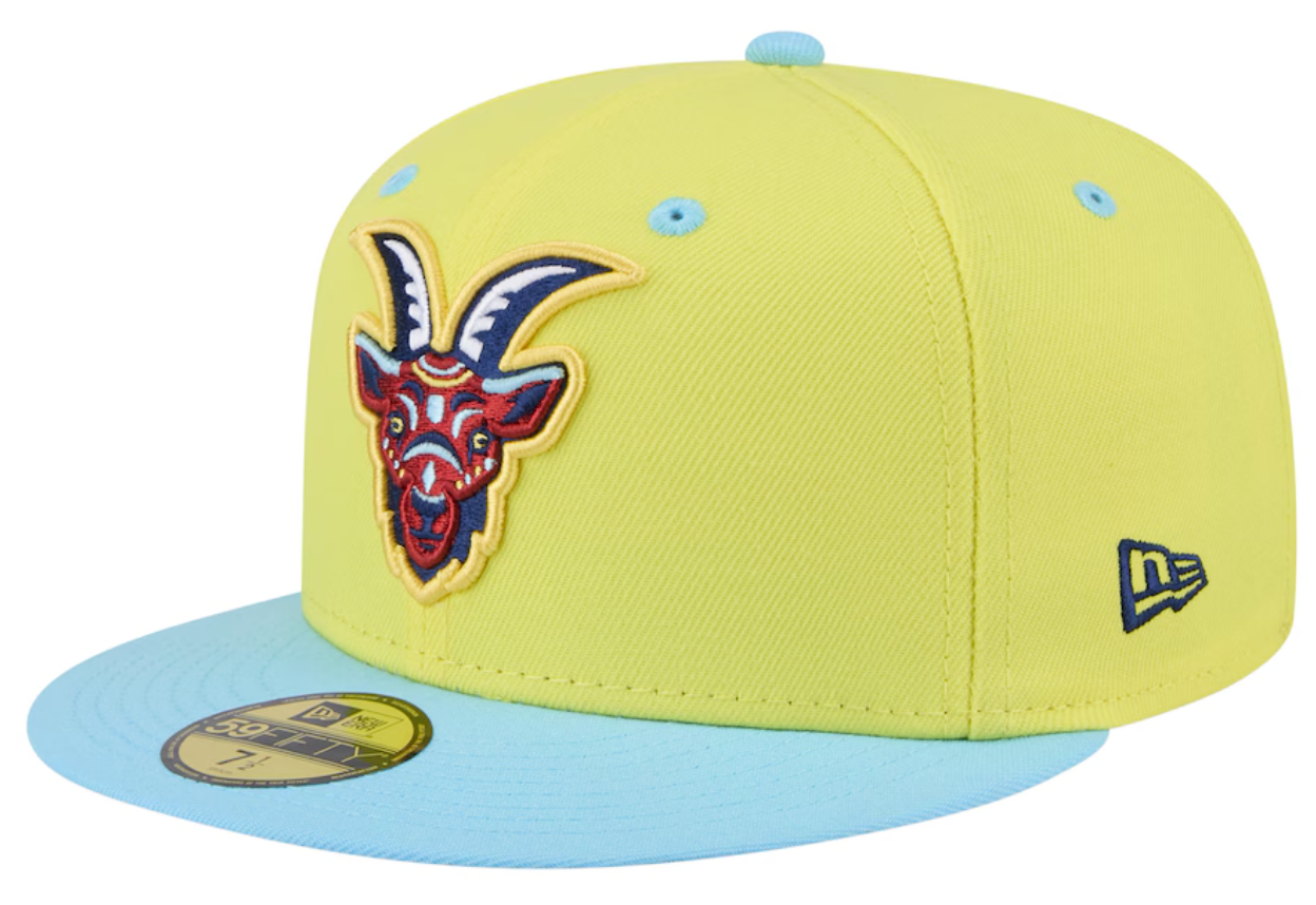
South Bend Cubs: When Curses Make Great Hats

The Cubs’ Yellow Copa de la Diversión hat pays homage to one of baseball’s great stories. “Los Cabritos Maldichos” – The Cursed Goats – is named in honor of a pivotal moment in Cubs history. William Sianis, owner and operator of the Billy Goats Tavern, and his goat were kicked out of Wrigley Field in 1945. On his way out he placed a curse on the team that they would never win another World Series.
Amazingly, that curse stood for 71 years until 2016 when it was finally broken. While it’s great to break a curse…Cubs fans can curse Sianis and his grumpy goat for their title drought. Now? We can all laugh about it and look fantastic in this unique piece of baseball storytelling.
The bright yellow and light blue color combo for paneling and accents is rare in baseball hats, and it works here. My only tiny complaint? The yellow stroke around the goat kind of disappears into the background. But honestly? The mascot is so good it doesn’t even matter. I also love the light blue brim, it really stands out to me in a crowded field of great hats.
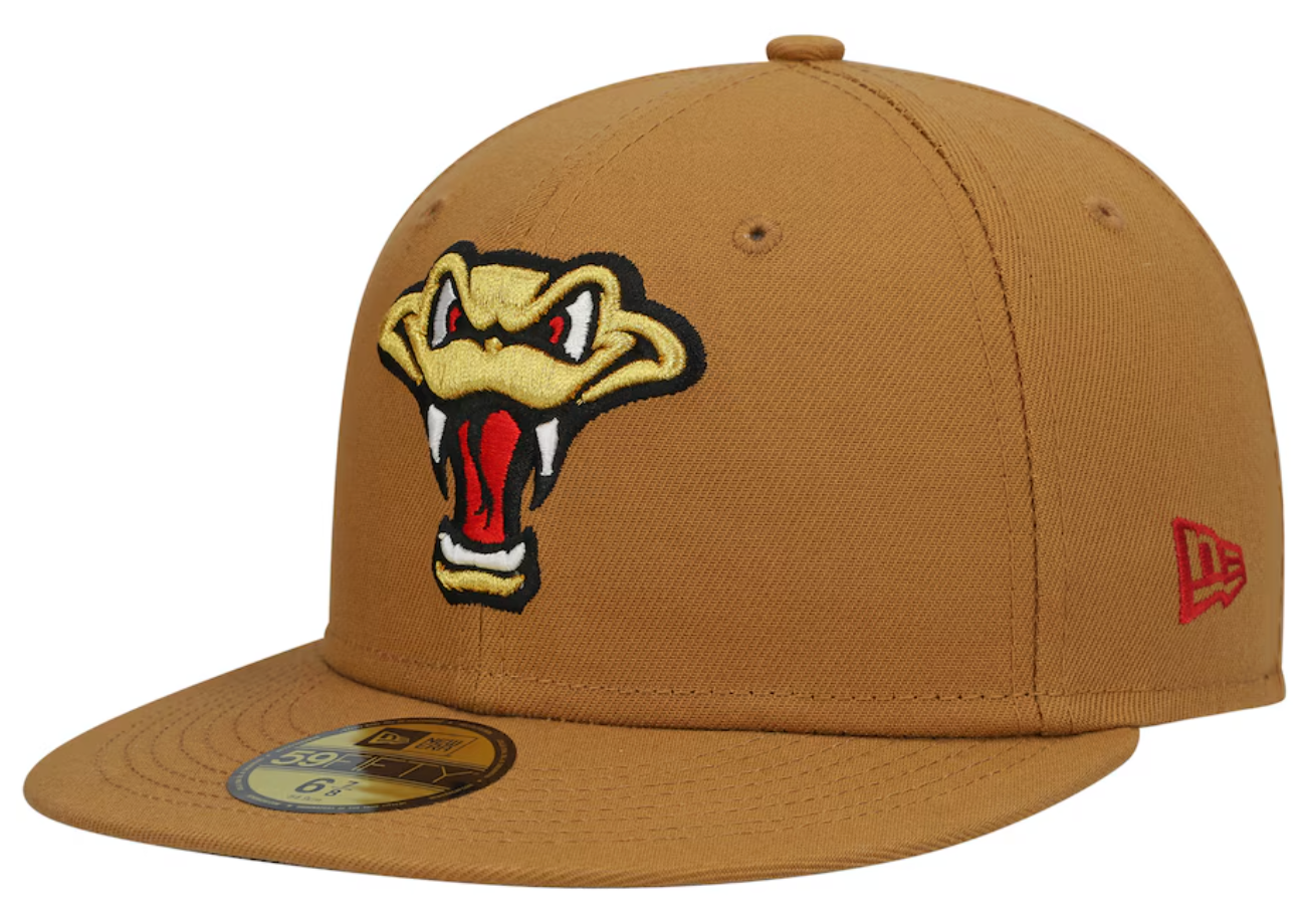
Wisconsin Timber Rattlers: Sometimes Simple is Perfect

attlers looked at that trend and went, “nah.” Here we have a simple hat in a color so rarely used, brown. It’s subtle, it’s simple, and it stands out precisely because it’s not trying to blind anyone with neon colors.
I love a face logo without an accompanying body. It creates this mysterious vibe that lets your imagination fill in the rest. It blends it into the hat in a fun way, and it draws your eyes directly into the eyes of the snake, ready to lull you to sleep before it strikes.
By not having to leave space for the rest of the snake head, it allows the logo to be larger solving one of my eternal complaints where logos have too much going on in too small space making them hard to see. This snake? Clear as day from a long distance. Great design.
This hat proves you don’t need fireworks and laser shows to make an impact. Sometimes, a well-executed simple design can be the boldest choice of all.
Final Thoughts on these MiLB Hats
The Midwest League (West) teams have created some of the most interesting hats in all of baseball. Majors or minors. Whether you’re into classic designs with a twist or completely off-the-wall concepts, there’s something here for everyone. When coupled with the excellent additions from the Eastern Division, the Midwest League is making a run for the title of having the best overall hats. Only time will tell if they pull it out in the end.
These hats are more than just pieces of merchandise; they’re conversation starters, style statements, and little pieces of baseball history you can wear. Whether you’re a serious collector or just someone who appreciates a great hat, you can’t go wrong with any of these choices. Though if you’re anything like me, you might end up wanting all of them.
If you value my work and want to support me, buy a hat from one of the links above! You can also buy me a cup of coffee! To find me elsewhere, check out my other social media platforms.

